At first glance I didn't appreciate the logo, I think it looks a bit too serious and almost reminds me of a stock line graph.

Looking further into the design and how it can be used I've realised it's a very versatile design that can be used to work in many different ways. Throughout the website it has been adapted to fit into many different situations.


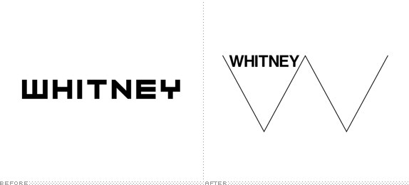
Experimental Jetset claim that they're design is to represent a heartbeat and the life of a city. This can be seen and I do think it fits in with the location of the museum being within a major city but quite clearly the design can be seen within the building which, I suppose could also be carrying on the theme of the heartbeat.
This is what Nicky in our group had to say as brief description:
Our group generally agreed that it's a successful and iconic rebrand that clearly identifies the museum. It's perfectly adaptable to screen, print and motion, and the Neue Haas Grotesk type's almost identical appearance with its descendant Helvetica gives it a very clear link to New York City's subway and transit identity. You know as soon as you look at it that it's based in New York, and clean inspiration is taken from the new building; its geometric angles and sharp edges clearly resonate in the new identity.
No comments:
Post a Comment