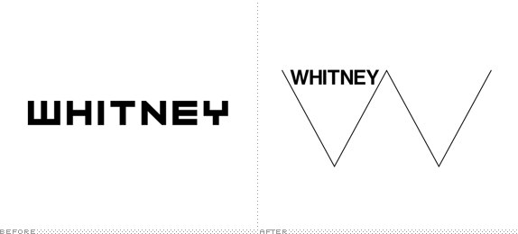
Friday, 30 October 2015

OUGD403 Studio Brief 2 - Typeface Design Manifesto

Manifesto for typeface -

My typeface will be future proof, it will withstand the test of time. The type will have to be strong and powerful making it and ideal choice for big corporate logos or strong companies to make their mark on the world.

Signage, advertisement and poster art is something to be considered for bold statements.

Thursday, 29 October 2015

OUGD403 Studio Brief 2 - Typeface Design Research


Strong

The task -

To research and create our own typeface design based on an adjective. Mine is 'Strong'

Based on one of Müeller-Brockmanns classic and lead typefaces, create your own bespoke typeface, which should effectively communicate your given adjective.
Garamond, Caslon, Baskerville, Bodoni, Clarendon, Berthold, Times, Helvetica, Univers


My view on the word -

Stand alone.
Withstanding the test of time.
Durable.
Muscular.
Leading.
Slab-Serif.
Architecture - Holding
Embossed - Chiselled.
Stability, Serif at bottom.
Block.
Bold just getting bolder.
Top heavy, missing a leg day.
Shapes of body builders.
Superheroes.
Little men in shape of letters.


How to design your own typeface -


The designer goes on to say you should start with a brief like we have, then choose a starting point like serif or san serif.

Pitfalls -

They speak of how people are quite often drawn to using their own handwriting, this is not a great start and doesn't make for an amazing typeface.
Speaking of further pitfalls they tell you not to base your typeface on a current one but this is part of our brief so I will ignore this for now.

Use your hands -

It's easier to get started with a task if you get something down. The quickest way to do so is to hand draw.
Get out a grid to get the dimensions right and just start sketching.

Moving to your computer -

Most people like to scan in their work and manually trace around the designs. Don't move across too soon to try and rush and finalise tour work.

Looking at words -

Try making your type into different words and seeing how it looks to make sure the design is how you would like it.

Study other typefaces -

Look at what you like about each typeface, be inspired.

Scale it -

Scale the type up as large as you can and a small as you can see if it's still legible and the design is to that you would like as a finished product.

Put it on paper -

Print the design on all different media.

Styles, weights and widths -

Try experimenting with all the above, Light, Regular, Bold, Italic etc.

Consider global use -

Consider where the type would be used on a global scale.


Tuesday, 27 October 2015

OUGD404 Study Task 2 How do you read? - Colour Relativity


We were asked to take a post it note and write our least favourite colour on it. I found this to be difficult because I don't really have a least favourite colour but maybe a least used colour instead.

I chose the colour green specifically this Pantone tone.


Like I previously said I don't hate or dislike this colour but I don't think I can see myself using it much. I just don't use the colour green often as I think it's hard to combine with other colours in block form and is usually nicer as either a stand alone colour or blended with a blue.


We were then asked to pick one other Pantone colour and Black to compliment our other. These colours would be used to make a children's book cover.


This is the colour I chose as I think it could be used to create a nice outdoor scene with the green chosen I could even blend the blue with the black to create a darker tone maybe some sort of night time scene would go nicely with the darker green. The book would be some sort of nature and adventure styled child's book.

I will be revisiting this task and creating the book cover mock up in a future blog post.


Wednesday, 21 October 2015

OUGD403 Studio Brief 1 - Logotype

The task -

To find a company within leeds to rebrand.


I chose Vue. The reason for this is because I work for the company and have done for nearly 3 years. I have to look at the logo on a regular basis and haven’t enjoyed it from the first time I saw it.

The logo I thought looked a bit dated, childish and I don’t think it portrays the companies image of being the best. They’re also the biggest and I believe this needs to be reflected.

I tried keeping the design to be fun as I think that’s key for an entertainment company. Therefore should be enjoyable in the experience it gives and in it’s image.


I started with Futura as the typeface, I thought it gave a more clean professional look to the brand. I wanted to bring the design into the present and give it a more modern look. My favourite design out of the Futura set was the one below. I had ideas to take the design further adding it to things like popcorn boxes and taking the brand through all different aspects.


I then tried out a different typeface; Bebas. I thought of using this type because it reminded me of the ones used to add credits to film posters. This then I think suited the whole company image. I tried experimenting in different colours with this typeface. I thought this would be an important step although I was pretty sure I would be sticking with the orange that Vue already sports in its design. 
My idea for keeping the colour scheme similar to what it already was was that I thought it would be best to stop myself from changing the brand too much this could potentially lose them business as they’ve changed their design completely people may believe they’ve changed their ownership.


Helvetica was thrown into the mix for my experiments because I still wanted to keep the modern clean look. I tried all sorts of different designs with Helvetica but couldn’t get the design to work as it looked too generic.


I came back and revised the Futura design and the Bebas design. This was so I could push myself further and make sure I’d made the best out of what I had.
I tried different colours and tones with the designs after I’d experimented I asked around which design people liked the best, the majority agreed the Bebas design was the better of the two. 
I tried taking making the typeface slightly curved with the Bebas design so it wasn’t as harsh but it was too subtle of a change and you couldn’t really tell and difference between the two.


I then took the design through to make it look like the type was part of an old film strip, nowadays films and cinemas are mainly digital but if you see a film strip you know what it’s for. This came across when I took the design round and gained some feedback. 

http://www.eudorareporter.com/wp-content/uploads/2011/02/Billboard.jpg


Once I had finished the design I tried putting it into practice with some billboard designs and with redesigning the website to suit the new modern look.


Generally people said that the design suited the company, the colours were friendly and welcoming. The fact I didn’t change from the original too much was good because it still had the same company feel whilst bringing it into a more modern age. 

I asked if people preferred my design from the original and again the majority did but some disagreed and explained that the original design was more friendly and modern.


Tuesday, 20 October 2015

OUGD404 Study Task 1 How do you read? - Colour Theory


We were asked to choose two colours, one to relate to a film genre and one that does not fit the usual style. This had to be done using a Pantone Colour Swatch


Horror

In a group we decided that Red reminds us of blood and death like you would see in a horror film. Bright green is one that you maybe wouldn't associate to the horror genre as it's not exactly scary it's more of a bright and happy colour.


Mystery

I picked a shade of black not quite fully black for mystery as it reminds me of a sort of Film Noire styled picture. The Blue is more of a hopeful colour it doesn't really make you wonder it sort of tells you what you're in for whereas grey through to black doesn't give anything away.


Sci-Fi

We chose Purple because as a genre Sci-Fi features a lot of mystery and includes a lot of the unknown. Mainly space, the colours in space are vast, beautiful and usually centre around purple blue and pink. The only time you would see yellow in a Sci-Fi film is if you were looking at fire as in a star or a rocket launch. If you're thinking about the vast space usually featured in the genre you wouldn't just think the black nothingness you would think of the galaxies planets and stars.


Western

Western is usually based about 100 years in the past in the Wild West of America. This then makes you think of old, sepia tones empty brown desserts not green lush countryside. Dirt roads and tracks would usually feature to put you back in the time it's meant to be set not green scenery you would see while driving through the Yorkshire Dales.


Monday, 19 October 2015

OUGD403 Analysis of The Whitney Art Museum's Identity


Whitney's new branding was taken on by Experimental Jetset in 2013. They wanted to link it to the new move and new building. The design is definitely bold, the negative space draws your eye in to the lettering straight away. All of the design is geometric and sharp, this again makes it pop, the design looks professional and like it should be taken seriously as a company. I couldn't see any other brand with this design so it's very unique to them and iconic, you managed to follow the line along as if it's leading onto something more. 
At first glance I didn't appreciate the logo, I think it looks a bit too serious and almost reminds me of a stock line graph. 


Looking further into the design and how it can be used I've realised it's a very versatile design that can be used to work in many different ways. Throughout the website it has been adapted to fit into many different situations.


This image is the new building that the design has been taken from you can see where they have gained inspiration to link the two together. Not only is it helpful for linking the logo to the building but vice versa as well as in the logo could've been designed to help the design of the building. It's a very structured logo the thin W literally holds up the bold Whitney which makes the logo stand strong.


Experimental Jetset claim that they're design is to represent a heartbeat and the life of a city. This can be seen and I do think it fits in with the location of the museum being within a major city but quite clearly the design can be seen within the building which, I suppose could also be carrying on the theme of the heartbeat.

This is what Nicky in our group had to say as brief description:

Our group generally agreed that it's a successful and iconic rebrand that clearly identifies the museum. It's perfectly adaptable to screen, print and motion, and the Neue Haas Grotesk type's almost identical appearance with its descendant Helvetica gives it a very clear link to New York City's subway and transit identity. You know as soon as you look at it that it's based in New York, and clean inspiration is taken from the new building; its geometric angles and sharp edges clearly resonate in the new identity. 

Friday, 16 October 2015

OUGD403 Study Task 2 - Symbol


YSP
(Yorkshire Sculpture Park)

The task - to use only a symbol to create a logo that would fit alongside the original type.
I think to use a sculpture from the park itself would be too obvious, too specific and it could be taken out of the park at any point.
This meant I would have to look for either permanent art or something different.


Bleed -


For inspiration on branding I looked towards the company Bleed. I had previously looked into the company for a task the week before. Going back to one of the branding tasks that the company had for Monier I looked into how they drew inspiration. Using parts of the
building the business is based in they managed to draw out different shapes for a logo
http://www.bleed.no/#monier
design. As you can see in the image below they have taken out the shapes of the windows on the side of the building and numbered them according to size then used them in different ways till they came out with a final design. I think the idea behind this is amazing and I’m going to look into similar inspiration for my own designs.


http://www.bleed.no/#monier


Henry Moore -

I looked into the history of the park next and the artists that are featured there. Henry Moore is one of the most influential sculptors for the park and his tools are even featured
there. I thought this would be a good idea to look into the tools that made the sculptures as that’s a good metaphor for the park and the art within it.


Barbara Hepworth -

Another influential artist is Barbara Hepworth. As you drive into the car park of the park these sculptures almost welcome you. I thought that would be a good way to link the logo
into the park. You would know where it was and it brings the work of the park into the logo.


James Turrel -

Turrel’s Sky Space is one of my favourite features in the park and it’s also a permanent piece. This I think makes it a brilliant idea to use parts of the Sky Space to inspire a design
for a logo. I will look into the architecture of the building and see how the space inspires be when I’m in there on our visit.

Experimentation


Above is a shot of some of my initial ideas for the symbols.

The top piece although looking a bit like The Starship Enterprise, has been created from a aerial view of the park. I thought this would be a great idea to incorporate the main hub of the park into the logo design and tie it all together. The shape uses negative space effectively like the brief asked and uses geometric shapes.

The next piece is of Turrel's Sky Space, one of my favourite things about the sculpture park. I took the three entrances to create shapes that I think I could've taken further to create something inspired by the DCM logo. 
The next piece is again park of the Sky Space, this time using the idea of the cut out from the top of the building to create something that uses negative space but not only that the original building reflects it looking up into the sky.

I said I didn't think it would be a good idea to use one of the pieces from the park but I think thought I best give it a try otherwise I would never know if it worked. I chose this piece because it's from one of the Sculpture Parks main contributors and inspirers, Barbara Hepworth. The piece is placed in the car park entrance which is where most visitors will first enter the park and therefore one of the first welcoming pieces, I thought this to be fitting with using it as the logo.

The last design is that of Henry Moore's hammer. Pretty much the soul of the park Moore inspired the whole idea from the start and his work is featured all over. I wanted to use a very basic shape and have a two tone colour scheme so that negative space could be used to the full effect of the piece.


Development

I decided to go ahead with the top design as I thought it fit the brief better than the rest and thought it was a bit different. The shapes were odd and they made you want to know more about it, it's only something you would notice when seeing an aerial view of the park which would mean that you would have to Google it therefore getting you more intrigued.


Finalised Design


I took the design further by removing the typography completely and leaving just the symbol. This I think helped the design to stand out on it's own and really use up all the space it had. I reversed the colours so that you could see it could be used in multiple different ways and therefore would be transferable.

I think if I were to do this task again then I would experiment with the shapes a bit more and see if I could push the design further. I could have a look more into the colour scheme and also see how and where the design could be placed.


Thursday, 15 October 2015

OUGD403 Study Task 1 - Collaborative Branding


The task was to rebrand a company chosen by Simon Harrison using only type and one of Vignelli's 6 basic typefaces.


Coral.

http://www.thedrum.com/news/2015/08/03/bookmaker-coral-announces-new-sponsorship-norwich-city

Our group had to rebrand the company Coral. This at first seemed like an easy task as we all agreed that we did not like the current logo. The colours were out dated, the typeface didn't seem to fit what the company was about and it didn't seem very transferable.


As a group we looked into all different aspects of the company, the design and the typeface. We did this very thoroughly and revisited key points like the typeface and the colour scheme.

In the bottom right image you can see that we listed pros and cons about the typefaces and what we thought they meant or put across within a design.


We tried the company name in each of the typefaces. After going back to the pros and cons of each we managed to decide on two final typefaces.

Futura

Bodoni


One of Sammy's ideas for using Bodoni, we wanted the heritage to come across in the design as it is a family name and goes all the way back to 1926.


Erin took the idea further with a hand rendered design. We all grouped together to discuss the design and after much consideration and little subtle tweaks we came up with our final design.


Below is the final logo design, like I mentioned before we wanted to take the company down a new route and visit the heritage of it. We believed that this would make it stand out as a company and portray a more up market and classy feel for the company.


Overall I think we have managed to achieve our original goal. We used one of Vignelli's Typefaces and managed to adapt it to create a fresh new classy look for a brand who's original image was a bit outdated. The brand I think is future proof and transferable as shown on a few examples ab


Sunday, 4 October 2015

OUGD403 First ever group brief.


The brief was set to design a map with different locations marked out.

Our group fit together well and we all took to the task as if we'd known each other a while. All of us put in ideas and gave feed back for what we though would work in the design. We each had a different design style as you might expect so we decided to make it look like a collaborative piece while still linking each but of work together.

At first Kieran came up with the idea to mark the map out as a detective would giving information from pins linked to string. We decided to keep the idea of pins and make it into a sort of digital 3D map as if all the places had Google map pins popping out of them.

We all took a different task; 
Bethan designed and drew out the map using bright colours fading out to grayscale from the centre of the map to show life in the city centre. 
Sophie designed the Liberty Park and Dock logo making the L into an anchor for the dock and adding a leaf for the park.
Kieran took to redesigning the Lamberts Yard logo using inspiration from the shop itself and incorporating an L and a Y into it.
I redesigned the Roxy Lanes logo using a flat vector based design and a two tone colour paler to keep the design simple but effective. 
Hannah made hand rendered designs taking inspiration from sculptures and the lettering for The Henry Moore Institute and IQ accomodation.
Anita had the task to design something to signify the train station and the Triangle accomodation.